Tube Access – coming soon
loveholidays

Lead Designer
Map Search
loveholidays
Product Designer

Context
Context
Map Search is a comparison tool that enables browsers to view holiday packages at a singular glance. It is used to filter search results based on destination and points of interests.
Map Search is a comparison tool that enables browsers to view holiday packages at a singular glance. It is used to filter search results based on destination and points of interests.
Map Search is a comparison tool that enables browsers to view holiday packages at a singular glance. It is used to filter search results based on destination and points of interests.
Problem analysis
Problem analysis
Problem analysis
Hotel comparison based on location was a frustrating experience
1️⃣ Missing link in the current search functionality
• Users found it hard to compare hotels using 2 key evaluators 1) price and 2) proximity to points of interest, e.g. Eiffel Tower through the existing search results page and filtering options.
2️⃣ Users were finding it hard to find out the relevant information in a singular page or tool
• The map feature was hidden in plain sight – high % of users clicking on a hotel was also clicking on the map tab, showing a correlation between intent to buy and browsing location.
• It took 5 clicks to go from browsing one hotel's location to viewing another which means the user has to go through loops to find deciding pieces of info.
3️⃣ Negative emotions associated with the discovery phase
• Planning a holiday elicits many negative emotions – e.g. a holiday is a large purchase and involves acquiring, digesting & comparing large amounts of information. We discovered that during the initial search phase, consumers often felt decision fatigue when planning a holiday.

Hotel location comparison was a frustrating experience
Hotel location comparison was a frustrating experience
1️⃣ Missing link in the current search functionality
• Users found it hard to compare hotels using 2 key evaluators 1) price and 2) proximity to points of interest, e.g. Eiffel Tower through the existing search results page and filtering options.
2️⃣ Users were finding it hard to find out the relevant information in a singular page or tool
• The map feature was hidden in plain sight – high % of users clicking on a hotel was also clicking on the map tab, showing a correlation between intent to buy and browsing location.
• It took 5 clicks to go from browsing one hotel's location to viewing another which means the user has to go through loops to find deciding pieces of info.
3️⃣ Negative emotions associated with the discovery phase
• Planning a holiday elicits many negative emotions – e.g. a holiday is a large purchase and involves acquiring, digesting & comparing large amounts of information. We discovered that during the initial search phase, consumers often felt decision fatigue when planning a holiday.
1️⃣ Missing link in the current search functionality
• Users found it hard to compare hotels using 2 key evaluators 1) price and 2) proximity to points of interest, e.g. Eiffel Tower through the existing search results page and filtering options.
2️⃣ Users were finding it hard to find out the relevant information in a singular page or tool
• The map feature was hidden in plain sight – high % of users clicking on a hotel was also clicking on the map tab, showing a correlation between intent to buy and browsing location.
• It took 5 clicks to go from browsing one hotel's location to viewing another which means the user has to go through loops to find deciding pieces of info.
3️⃣ Negative emotions associated with the discovery phase
• Planning a holiday elicits many negative emotions – e.g. a holiday is a large purchase and involves acquiring, digesting & comparing large amounts of information. We discovered that during the initial search phase, consumers often felt decision fatigue when planning a holiday.
1️⃣ Missing link in the current search functionality
• Users found it hard to compare hotels using 2 key evaluators 1) price and 2) proximity to points of interest, e.g. Eiffel Tower through the existing search results page and filtering options.
2️⃣ Users were finding it hard to find out the relevant information in a singular page or tool
• The map feature was hidden in plain sight – high % of users clicking on a hotel was also clicking on the map tab, showing a correlation between intent to buy and browsing location.
• It took 5 clicks to go from browsing one hotel's location to viewing another which means the user has to go through loops to find deciding pieces of info.
3️⃣ Negative emotions associated with the discovery phase
• Planning a holiday elicits many negative emotions – e.g. a holiday is a large purchase and involves acquiring, digesting & comparing large amounts of information. We discovered that during the initial search phase, consumers often felt decision fatigue when planning a holiday.

From left to right: search results page -> price & availability page -> hotel details page
(accessed by clicking 'map link').
From left to right: search results page -> price & availability page -> hotel details page (accessed by clicking ‘map link’).
Overview
Opportunity: Allow users to compare hotels based on location, value and price, at a glance.
Strategy: Design a comparison feature for the search page.
Success criteria
The product manager and I observed that this work would not only impact business metrics but also aimed to improve the overall user experience across the discovery phase, which is key to converting browsing users to paid customers. We defined success across two levels: user experience impact and business performance.
At a high level, success meant improving user engagement and reducing friction on the search results page, with a target of achieving a 1% uplift step conversion and a measurable reduction in drop-off rates during discovery.
UX impact
At a feature level, success was measured by whether map search effectively addressed key user pain points. Specifically, the experience needed to:
Enable clear comparison between hotels without requiring users to open multiple pages
Support practical decision-making through filters such as budget and location
Help users assess hotel value by visualising proximity to key points of interest
Business performance
Increase in step conversion and over CVR from search results page to checkout
Contribute to the quarterly OKR of delivering ten city-break improvement
Platforms: iOS, Android, Web
4️⃣ Users are primarily browsing through mobile
• Users found it frustrating that the only way to compare was to open multiple hotel tabs in the browser. This was not intuitive when browsing on smaller screens and as a company we were striving to improve the experience cross-platform with a mobile-first mindset.
4️⃣ Users are primarily browsing through mobile
• Users found it frustrating that the only way to compare was to open multiple hotel tabs in the browser. This was not intuitive when browsing on smaller screens and as a company we were striving to improve the experience cross-platform with a mobile-first mindset.
4️⃣ Users are primarily browsing through mobile
• Users found it frustrating that the only way to compare was to open multiple hotel tabs in the browser. This was not intuitive when browsing on smaller screens and as a company we were striving to improve the experience cross-platform with a mobile-first mindset.
Overview
Problem: Customers find it difficult to compare suitable holiday packages
based on location.
Problem: Customers find it difficult to compare suitable holiday packages
based on location.
Problem: Customers find it difficult to compare suitable holiday packages based on location.
Problem: Customers find it difficult to compare suitable holiday packages based on location.
Opportunity: Allow users to compare hotels based on location, value and price, at a glance.
Strategy: Design a comparison feature for the search page.
Success criteria
The product manager and I observed that this work would not only impact business metrics but also aimed to improve the overall user experience across the discovery phase, which is key to converting browsing users to paid customers. We defined success across two levels: user experience impact and business performance.
At a high level, success meant improving user engagement and reducing friction on the search results page, with a target of achieving a 1% uplift step conversion and a measurable reduction in drop-off rates during discovery.
UX impact
At a feature level, success was measured by whether map search effectively addressed key user pain points. Specifically, the experience needed to:
Enable clear comparison between hotels without requiring users to open multiple pages
Support practical decision-making through filters such as budget and location
Help users assess hotel value by visualising proximity to key points of interest
Business performance
Increase in step conversion and over CVR from search results page to checkout
Contribute to the quarterly OKR of delivering ten city-break improvement
Platforms: iOS, Android, Web
Opportunity: Allow users to compare hotels based on location, value and price, at a glance.
Strategy: Design a comparison feature for the search page.
Success criteria
The product manager and I observed that this work would not only impact business metrics but also aimed to improve the overall user experience across the discovery phase, which is key to converting browsing users to paid customers. We defined success across two levels: user experience impact and business performance.
At a high level, success meant improving user engagement and reducing friction on the search results page, with a target of achieving a 1% uplift step conversion and a measurable reduction in drop-off rates during discovery.
UX impact
At a a feature level, success was measured by whether map search effectively addressed key user pain points. Specifically, the experience needed to:
Enable clear comparison between hotels without requiring users to open multiple pages
Support practical decision-making through filters such as budget and location
Help users assess hotel value by visualising proximity to key points of interest
Business performance
Increase in step conversion and over CVR from search results page to checkout
Contribute to the quarterly OKR of delivering ten city-break improvement
Platforms: iOS, Android, Web
Opportunity: Allow users to compare hotels based on location, value and price, at a glance.
Strategy: Design a comparison feature for the search page.
Success criteria
The product manager and I observed that this work would not only impact business metrics but also aimed to improve the overall user experience across the discovery phase, which is key to converting browsing users to paid customers. We defined success across two levels: user experience impact and business performance.
At a high level, success meant improving user engagement and reducing friction on the search results page, with a target of achieving a 1% uplift step conversion and a measurable reduction in drop-off rates during discovery.
UX impact
At a a feature level, success was measured by whether map search effectively addressed key user pain points. Specifically, the experience needed to:
Enable clear comparison between hotels without requiring users to open multiple pages
Support practical decision-making through filters such as budget and location
Help users assess hotel value by visualising proximity to key points of interest
Business performance
Increase in step conversion and over CVR from search results page to checkout
Contribute to the quarterly OKR of delivering ten city-break improvement
Platforms: iOS, Android, Web
From left to right: search results page -> price & availability page -> hotel details page
(accessed by clicking 'map link').
Opportunity: Allow users to compare hotels based on location, value and price, at a glance.
Strategy: Design a comparison feature for the search page.
Success criteria
The product manager and I observed that this work would not only impact business metrics but also aimed to improve the overall user experience across the discovery phase, which is key to converting browsing users to paid customers. We defined success across two levels: user experience impact and business performance.
At a high level, success meant improving user engagement and reducing friction on the search results page, with a target of achieving a 1% uplift step conversion and a measurable reduction in drop-off rates during discovery.
UX impact
At a feature level, success was measured by whether map search effectively addressed key user pain points. Specifically, the experience needed to:
Enable clear comparison between hotels without requiring users to open multiple pages
Support practical decision-making through filters such as budget and location
Help users assess hotel value by visualising proximity to key points of interest
Business performance
Increase in step conversion and over CVR from search results page to checkout
Contribute to the quarterly OKR of delivering ten city-break improvement
Platforms: iOS, Android, Web
Overview
Overview
Overview
Overview
Design Process
Design Process
Usability Testing
Usability Testing


Design system
Design system


Final Solution – it's live!
Preview
Preview
I did a detailed competitor analysis report that analysed current market trends and evaluated the map search experiences of 10 key players in the travel industry. I used this data to create a benchmark for common design patterns and industry standards, as well as items that we won’t have time for in the MVP but that are considerations to think about at a later point.
I did a detailed competitor analysis report that analysed current market trends and evaluated the map search experiences of 10 key players in the travel industry. I used this data to create a benchmark for common design patterns and industry standards, as well as items that we won’t have time for in the MVP but that are considerations to think about at a later point.
Once I had done some initial ideation, I ran a round of unmoderated UserTesting to see whether the proposed solution made sense to our target audience. The objective was to see whether they could access the map tool easily and test the usability of the design, e.g. the placement and colour of the map button (see button highlighted in red).
With the input of the researchers, I designed a screener survey to capture our target audience (e.g. “what type of traveler are you?”) and ran both the pilot and the first round of testing end to end. I had a variety of different aged participants, giving us a broad range of perspectives, and ran the test on both desktop and mobile.
Once I had done some initial ideation, I ran a round of unmoderated UserTesting to see whether the proposed solution made sense to our target audience. The objective was to see whether they could access the map tool easily and test the usability of the design, e.g. the placement and colour of the map button (see button highlighted in red).
With the input of the researchers, I designed a screener survey to capture our target audience (e.g. “what type of traveler are you?”) and ran both the pilot and the first round of testing end to end. I had a variety of different aged participants, giving us a broad range of perspectives, and ran the test on both desktop and mobile.
Re-envisioning a new map-based search feature required me to think outside the box whilst maintaining the look and feel of the brand. Following the brand guidelines and existing design system, I made the following contributions:
Map button
I had multiple versions of the map button colour, including considering placement and layout for both mobile and desktop. With this particular iteration, I couldn't land on a design that was consistent to both screen sizes but managed to utilise the available space until the next iteration.
💡Usability research insight: Initially, I landed on the white/black outline option, as we didn't want to use our primary colour (blue). However, I quickly discovered that users found it hard to spot, and decided to change the colour in a following iteration.
Map pin & interactions
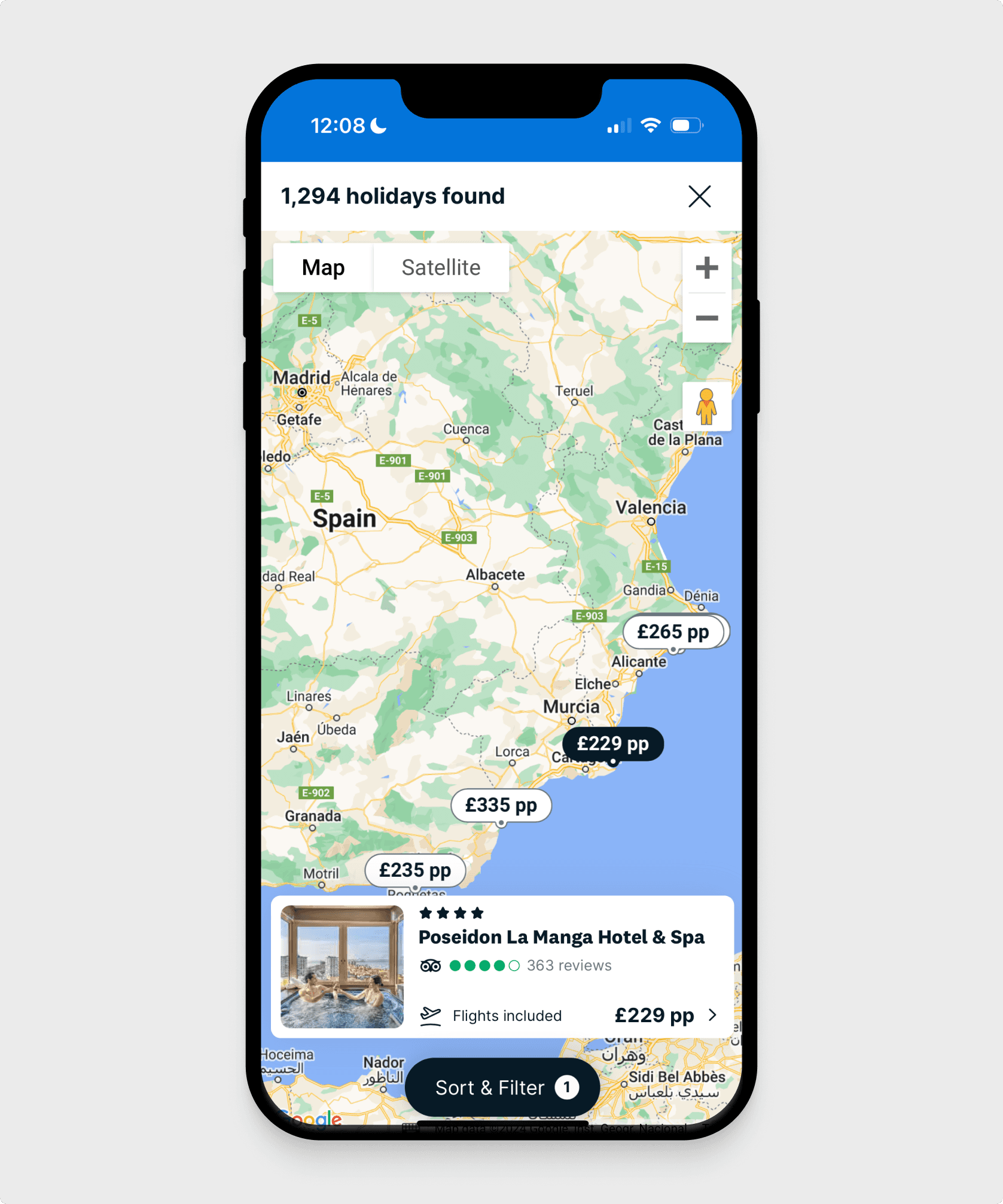
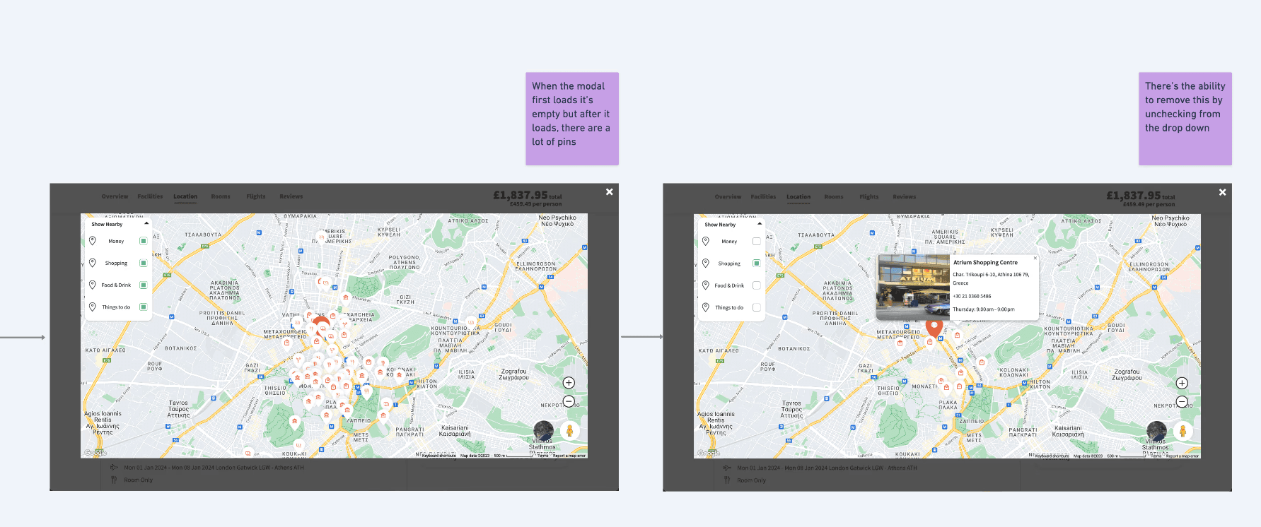
I went with the white/black option to make sure it passed accessibility criteria. It was the best option against the colourful background of the Google Maps API, and also allowed me to bake in a 'previously viewed' state – when the user has clicked a pin and clicked another, it changes the colour to differentiate it from pins that have not yet been viewed.
Map card
Rather than extracting the same information from what appears on the search results page, we decided only to keep the key information that helps user make an initial decision: hotel name, star rating, Trip Advisor reviews, and price per person.
💡Usability research insight: The “£327pp” price was confusing to participants. To address this, we later added “flights included” to the map card, clarifying that the price actually covered the hotel and the flights per person.
Re-envisioning a new map-based search feature required me to think outside the box whilst maintaining the look and feel of the brand. Following the brand guidelines and existing design system, I made the following contributions:
Map button
I had multiple versions of the map button colour, including considering placement and layout for both mobile and desktop. With this particular iteration, I couldn't land on a design that was consistent to both screen sizes but managed to utilise the available space until the next iteration.
💡Usability research insight: Initially, I landed on the white/black outline option, as we didn't want to use our primary colour (blue). However, I quickly discovered that users found it hard to spot, and decided to change the colour in a following iteration.
Map pin & interactions
I went with the white/black option to make sure it passed accessibility criteria. It was the best option against the colourful background of the Google Maps API, and also allowed me to bake in a 'previously viewed' state – when the user has clicked a pin and clicked another, it changes the colour to differentiate it from pins that have not yet been viewed.
Map card
Rather than extracting the same information from what appears on the search results page, we decided only to keep the key information that helps user make an initial decision: hotel name, star rating, Trip Advisor reviews, and price per person.
💡Usability research insight: The “£327pp” price was confusing to participants. To address this, we later added “flights included” to the map card, clarifying that the price actually covered the hotel and the flights per person.
Re-envisioning a new map-based search feature required me to think outside the box whilst maintaining the look and feel of the brand. Following the brand guidelines and existing design system, I made the following contributions:
Map button
I had multiple versions of the map button colour, including considering placement and layout for both mobile and desktop. With this particular iteration, I couldn't land on a design that was consistent to both screen sizes but managed to utilise the available space until the next iteration.
💡Usability research insight: Initially, I landed on the white/black outline option, as we didn't want to use our primary colour (blue). However, I quickly discovered that users found it hard to spot, and decided to change the colour in a following iteration.
Map pin & interactions
I went with the white/black option to make sure it passed accessibility criteria. It was the best option against the colourful background of the Google Maps API, and also allowed me to bake in a 'previously viewed' state – when the user has clicked a pin and clicked another, it changes the colour to differentiate it from pins that have not yet been viewed.
Map card
Rather than extracting the same information from what appears on the search results page, we decided only to keep the key information that helps user make an initial decision: hotel name, star rating, Trip Advisor reviews, and price per person.
💡Usability research insight: The “£327pp” price was confusing to participants. To address this, we later added “flights included” to the map card, clarifying that the price actually covered the hotel and the flights per person.
Final Solution – it's live!
Design Process
Usability Testing
Design system
Final Solution – it's live!
Preview
I did a detailed competitor analysis report that analysed current market trends and evaluated the map search experiences of 10 key players in the travel industry. I used this data to create a benchmark for common design patterns and industry standards, as well as items that we won’t have time for in the MVP but that are considerations to think about at a later point.
Once I had done some initial ideation, I ran a round of unmoderated UserTesting to see whether the proposed solution made sense to our target audience. The objective was to see whether they could access the map tool easily and test the usability of the design, e.g. the placement and colour of the map button (see button highlighted in red).
With the input of the researchers, I designed a screener survey to capture our target audience (e.g. “what type of traveler are you?”) and ran both the pilot and the first round of testing end to end. I had a variety of different aged participants, giving us a broad range of perspectives, and ran the test on both desktop and mobile.
Re-envisioning a new map-based search feature required me to think outside the box whilst maintaining the look and feel of the brand. Following the brand guidelines and existing design system, I made the following contributions:
Map button
I had multiple versions of the map button colour, including considering placement and layout for both mobile and desktop. With this particular iteration, I couldn't land on a design that was consistent to both screen sizes but managed to utilise the available space until the next iteration.
💡Usability research insight: Initially, I landed on the white/black outline option, as we didn't want to use our primary colour (blue). However, I quickly discovered that users found it hard to spot, and decided to change the colour in a following iteration.
Map pin & interactions
I went with the white/black option to make sure it passed accessibility criteria. It was the best option against the colourful background of the Google Maps API, and also allowed me to bake in a 'previously viewed' state – when the user has clicked a pin and clicked another, it changes the colour to differentiate it from pins that have not yet been viewed.
Map card
Rather than extracting the same information from what appears on the search results page, we decided only to keep the key information that helps user make an initial decision: hotel name, star rating, Trip Advisor reviews, and price per person.
💡Usability research insight: The “£327pp” price was confusing to participants. To address this, we later added “flights included” to the map card, clarifying that the price actually covered the hotel and the flights per person.
Reflections and next steps
Reflections and next steps
Problem analysis
Hotel comparison based on location was a frustrating experience
1️⃣ Missing link in the current search functionality
• Users found it hard to compare hotels using 2 key evaluators 1) price and 2) proximity to points of interest, e.g. Eiffel Tower through the existing search results page and filtering options.
2️⃣ Users were finding it hard to find out the relevant information in a singular page or tool
• The map feature was hidden in plain sight – high % of users clicking on a hotel was also clicking on the map tab, showing a correlation between intent to buy and browsing location.
• It took 5 clicks to go from browsing one hotel's location to viewing another which means the user has to go through loops to find deciding pieces of info.
3️⃣ Negative emotions associated with the discovery phase
• Planning a holiday elicits many negative emotions – e.g. a holiday is a large purchase and involves acquiring, digesting & comparing large amounts of information. We discovered that during the initial search phase, consumers often felt decision fatigue when planning a holiday.
From left to right: search results page -> price & availability page -> hotel details page (accessed by clicking ‘map link’).
Overview
Opportunity: Allow users to compare hotels based on location, value and price, at a glance.
Strategy: Design a comparison feature for the search page.
Success criteria
The product manager and I observed that this work would not only impact business metrics but also aimed to improve the overall user experience across the discovery phase, which is key to converting browsing users to paid customers. We defined success across two levels: user experience impact and business performance.
At a high level, success meant improving user engagement and reducing friction on the search results page, with a target of achieving a 1% uplift step conversion and a measurable reduction in drop-off rates during discovery.
UX impact
At a feature level, success was measured by whether map search effectively addressed key user pain points. Specifically, the experience needed to:
Enable clear comparison between hotels without requiring users to open multiple pages
Support practical decision-making through filters such as budget and location
Help users assess hotel value by visualising proximity to key points of interest
Business performance
Increase in step conversion and over CVR from search results page to checkout
Contribute to the quarterly OKR of delivering ten city-break improvement
Platforms: iOS, Android, Web
4️⃣ Users are primarily browsing through mobile
• Users found it frustrating that the only way to compare was to open multiple hotel tabs in the browser. This was not intuitive when browsing on smaller screens and as a company we were striving to improve the experience cross-platform with a mobile-first mindset.
Problem: Customers find it difficult to compare suitable holiday packages
based on location.
Design Process
Usability Testing
Re-envisioning a new map-based search feature required me to think outside the box whilst maintaining the look and feel of the brand. Following the brand guidelines and existing design system, I made the following contributions:
Map button
I had multiple versions of the map button colour, including considering placement and layout for both mobile and desktop. With this particular iteration, I couldn't land on a design that was consistent to both screen sizes but managed to utilise the available space until the next iteration.
💡Usability research insight: Initially, I landed on the white/black outline option, as we didn't want to use our primary colour (blue). However, I quickly discovered that users found it hard to spot, and decided to change the colour in a following iteration.
Map pin & interactions
I went with the white/black option to make sure it passed accessibility criteria. It was the best option against the colourful background of the Google Maps API, and also allowed me to bake in a 'previously viewed' state – when the user has clicked a pin and clicked another, it changes the colour to differentiate it from pins that have not yet been viewed.
Map card
Rather than extracting the same information from what appears on the search results page, we decided only to keep the key information that helps user make an initial decision: hotel name, star rating, Trip Advisor reviews, and price per person.
💡Usability research insight: The “£327pp” price was confusing to participants. To address this, we later added “flights included” to the map card, clarifying that the price actually covered the hotel and the flights per person.
Design system
Final Solution – it's live!
Preview
I did a detailed competitor analysis report that analysed current market trends and evaluated the map search experiences of 10 key players in the travel industry. I used this data to create a benchmark for common design patterns and industry standards, as well as items that we won’t have time for in the MVP but that are considerations to think about at a later point.
Once I had done some initial ideation, I ran a round of unmoderated UserTesting to see whether the proposed solution made sense to our target audience. The objective was to see whether they could access the map tool easily and test the usability of the design, e.g. the placement and colour of the map button (see button highlighted in red).
With the input of the researchers, I designed a screener survey to capture our target audience (e.g. “what type of traveler are you?”) and ran both the pilot and the first round of testing end to end. I had a variety of different aged participants, giving us a broad range of perspectives, and ran the test on both desktop and mobile.
Reflections and next steps
Problem analysis
Hotel comparison based on location was a frustrating experience
1️⃣ Missing link in the current search functionality
• Users found it hard to compare hotels using 2 key evaluators 1) price and 2) proximity to points of interest, e.g. Eiffel Tower through the existing search results page and filtering options.
2️⃣ Users were finding it hard to find out the relevant information in a singular page or tool
• The map feature was hidden in plain sight – high % of users clicking on a hotel was also clicking on the map tab, showing a correlation between intent to buy and browsing location.
• It took 5 clicks to go from browsing one hotel's location to viewing another which means the user has to go through loops to find deciding pieces of info.
3️⃣ Negative emotions associated with the discovery phase
• Planning a holiday elicits many negative emotions – e.g. a holiday is a large purchase and involves acquiring, digesting & comparing large amounts of information. We discovered that during the initial search phase, consumers often felt decision fatigue when planning a holiday.
Reflections and next steps
Design Process
Design Process
Usability Testing
Re-envisioning a new map-based search feature required me to think outside the box whilst maintaining the look and feel of the brand. Following the brand guidelines and existing design system, I made the following contributions:
Map button
I had multiple versions of the map button colour, including considering placement and layout for both mobile and desktop. With this particular iteration, I couldn't land on a design that was consistent to both screen sizes but managed to utilise the available space until the next iteration.
💡Usability research insight: Initially, I landed on the white/black outline option, as we didn't want to use our primary colour (blue). However, I quickly discovered that users found it hard to spot, and decided to change the colour in a following iteration.
Map pin & interactions
I went with the white/black option to make sure it passed accessibility criteria. It was the best option against the colourful background of the Google Maps API, and also allowed me to bake in a 'previously viewed' state – when the user has clicked a pin and clicked another, it changes the colour to differentiate it from pins that have not yet been viewed.
Map card
Rather than extracting the same information from what appears on the search results page, we decided only to keep the key information that helps user make an initial decision: hotel name, star rating, Trip Advisor reviews, and price per person.
💡Usability research insight: The “£327pp” price was confusing to participants. To address this, we later added “flights included” to the map card, clarifying that the price actually covered the hotel and the flights per person.
Design system
Final Solution – it's live!
Preview
I did a detailed competitor analysis report that analysed current market trends and evaluated the map search experiences of 10 key players in the travel industry. I used this data to create a benchmark for common design patterns and industry standards, as well as items that we won’t have time for in the MVP but that are considerations to think about at a later point.
Once I had done some initial ideation, I ran a round of unmoderated UserTesting to see whether the proposed solution made sense to our target audience. The objective was to see whether they could access the map tool easily and test the usability of the design, e.g. the placement and colour of the map button (see button highlighted in red).
With the input of the researchers, I designed a screener survey to capture our target audience (e.g. “what type of traveler are you?”) and ran both the pilot and the first round of testing end to end. I had a variety of different aged participants, giving us a broad range of perspectives, and ran the test on both desktop and mobile.
From left to right: search results page -> price & availability page -> hotel details page (accessed by clicking ‘map link’).
Overview
Opportunity: Allow users to compare hotels based on location, value and price, at a glance.
Strategy: Design a comparison feature for the search page.
Success criteria
The product manager and I observed that this work would not only impact business metrics but also aimed to improve the overall user experience across the discovery phase, which is key to converting browsing users to paid customers. We defined success across two levels: user experience impact and business performance.
At a high level, success meant improving user engagement and reducing friction on the search results page, with a target of achieving a 1% uplift step conversion and a measurable reduction in drop-off rates during discovery.
UX impact
At a a feature level, success was measured by whether map search effectively addressed key user pain points. Specifically, the experience needed to:
Enable clear comparison between hotels without requiring users to open multiple pages
Support practical decision-making through filters such as budget and location
Help users assess hotel value by visualising proximity to key points of interest
Business performance
Increase in step conversion and over CVR from search results page to checkout
Contribute to the quarterly OKR of delivering ten city-break improvement
Platforms: iOS, Android, Web
4️⃣ Users are primarily browsing through mobile
• Users found it frustrating that the only way to compare was to open multiple hotel tabs in the browser. This was not intuitive when browsing on smaller screens and as a company we were striving to improve the experience cross-platform with a mobile-first mindset.
Problem: Customers find it difficult to compare suitable holiday packages
based on location.
Problem analysis
Hotel location comparison was a frustrating experience
1️⃣ Missing link in the current search functionality
• Users found it hard to compare hotels using 2 key evaluators 1) price and 2) proximity to points of interest, e.g. Eiffel Tower through the existing search results page and filtering options.
2️⃣ Users were finding it hard to find out the relevant information on a singular page
• The map feature was hidden in plain sight – high % of users clicking on a hotel card was also clicking on the map tab, showing a correlation between intent to buy and browsing location.
• It took 5 clicks to go from browsing one hotel’s location to viewing another which meant the user had to go through loops to find deciding pieces of info.
3️⃣ Negative emotions associated with the discovery phase
• Planning a holiday elicits many negative emotions – e.g. a holiday is a large purchase and involves acquiring, digesting & comparing large amounts of information. We discovered that during the initial search phase, consumers often felt decision fatigue when planning a holiday.
Context
Map Search is a comparison tool that enables browsers to view holiday packages at a singular glance. It is used to filter search results based on destination and points of interests.

Tube Access – coming soon
Lead Designer